Reminders that work
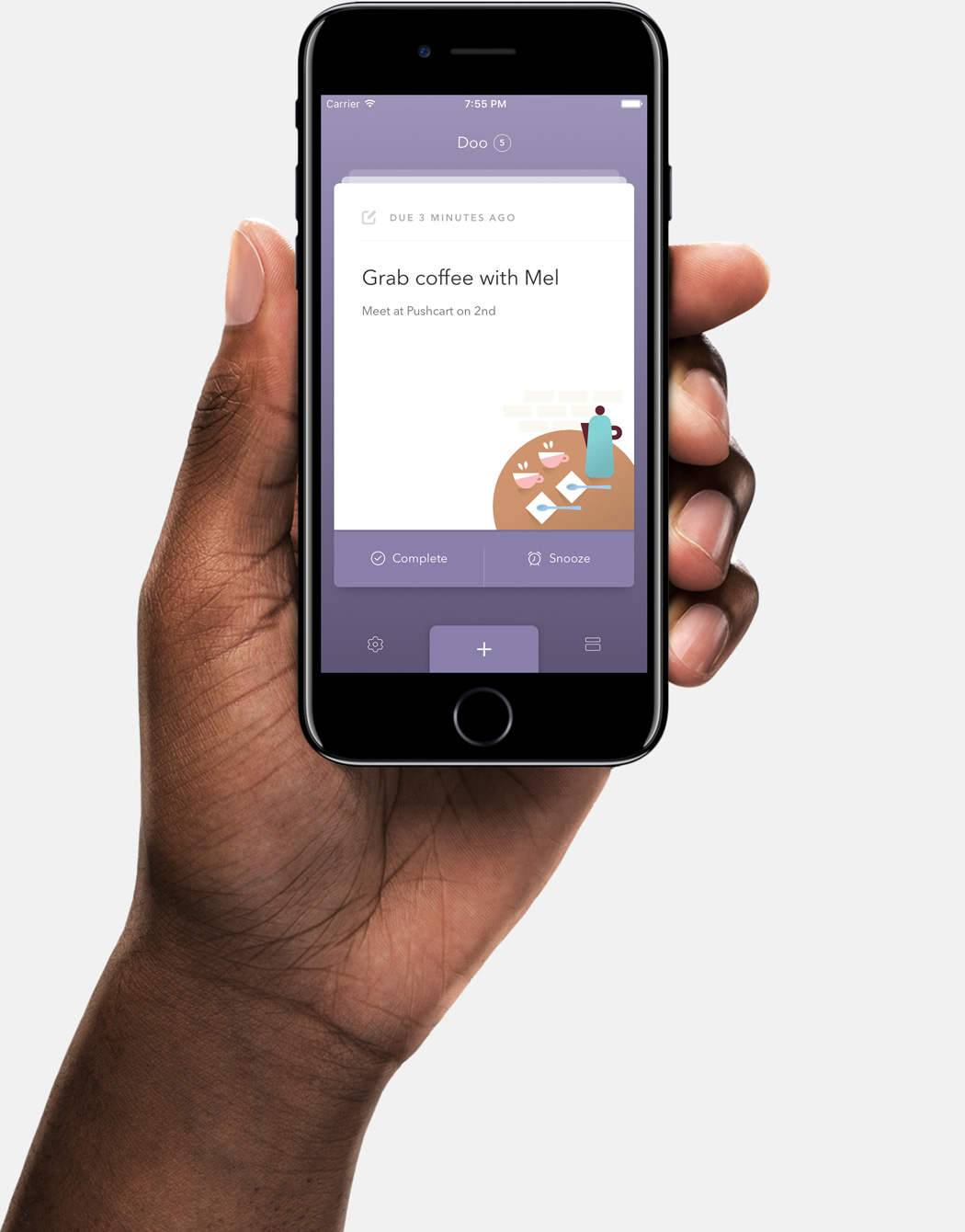

Doo is an app I conceptualized, designed, and built as my first self-funded product. I created it in response to the frustration I felt trying to find a simple, elegant to-do app. Popular solutions were either too complicated or too unattractive. Doo has a deliberate, streamlined feature set based on the psychology of stress and stress reduction. This means that instead of replicating a pencil and paper, Doo helps you set achievable goals, and gives you the means to become a more disciplined you.
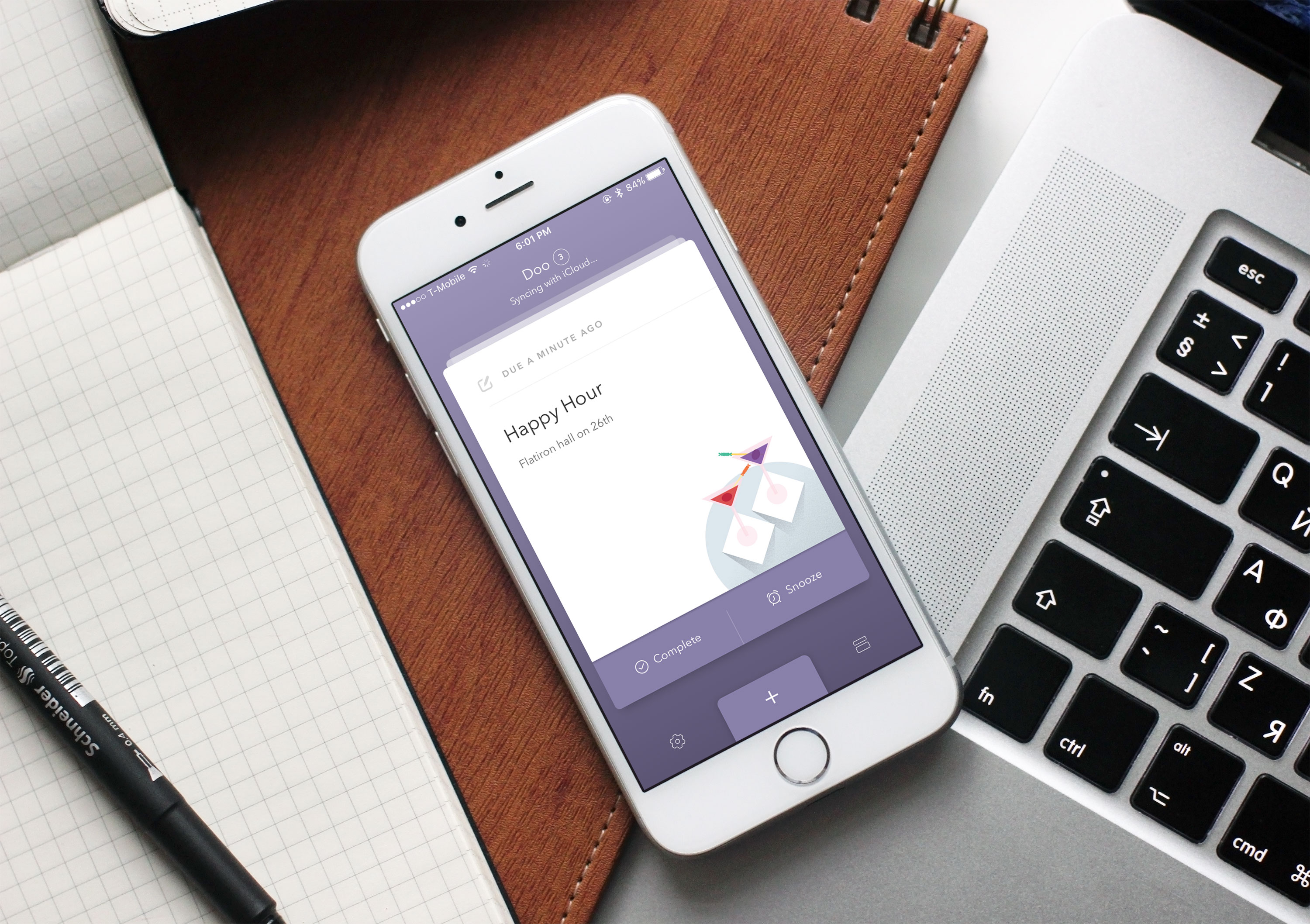
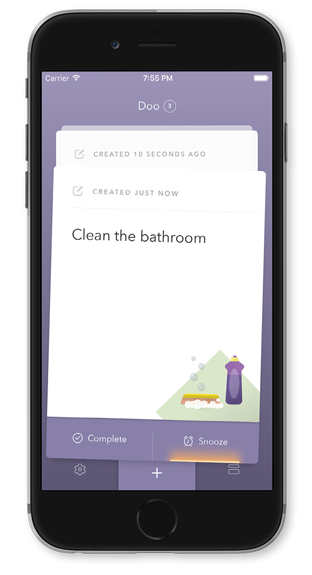
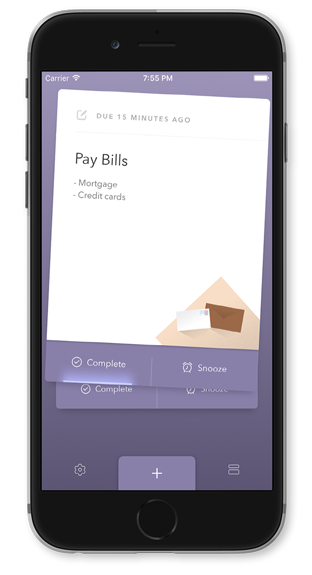
The stack makes Doo special. Instead of showing tasks in a list, Doo shows one task at a time to help you focus. Swipe cards down to get reminded later or up to mark them completed.
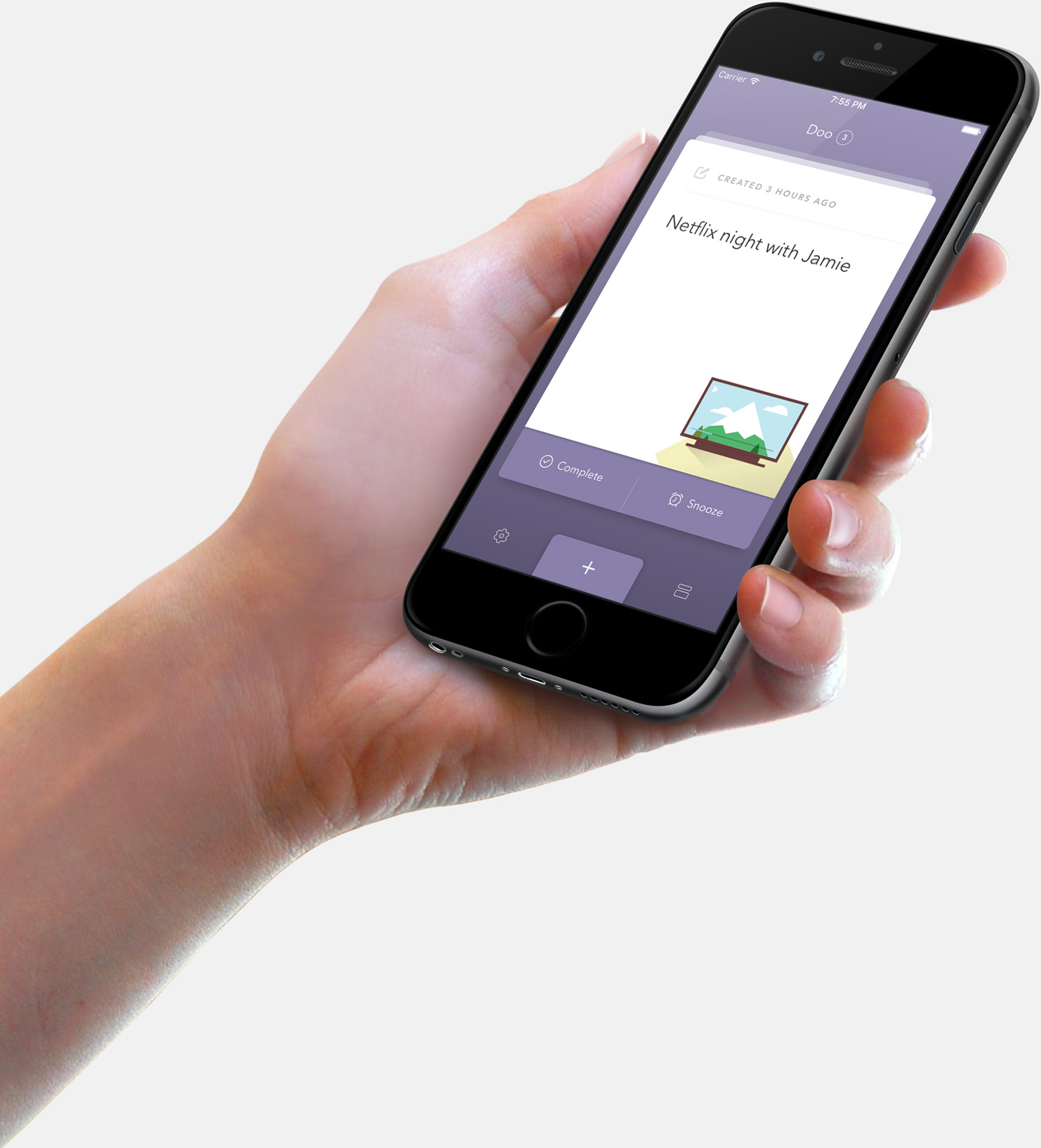
Procrastination is easy without an obvious first step. Your mind wanders. Doo is designed to be a natural extension of how your brain works by helping you keep things simple and actionable.
Reminders includes a few primary attributes, including the title, due date, and notes. I limited the number of fields per card to optimize for the snooze workflow. The less visual noise, the quicker it is to triage the card stack. Information like the repeat duration and snooze count don’t provide enough value when trying to figure out what to work on next.
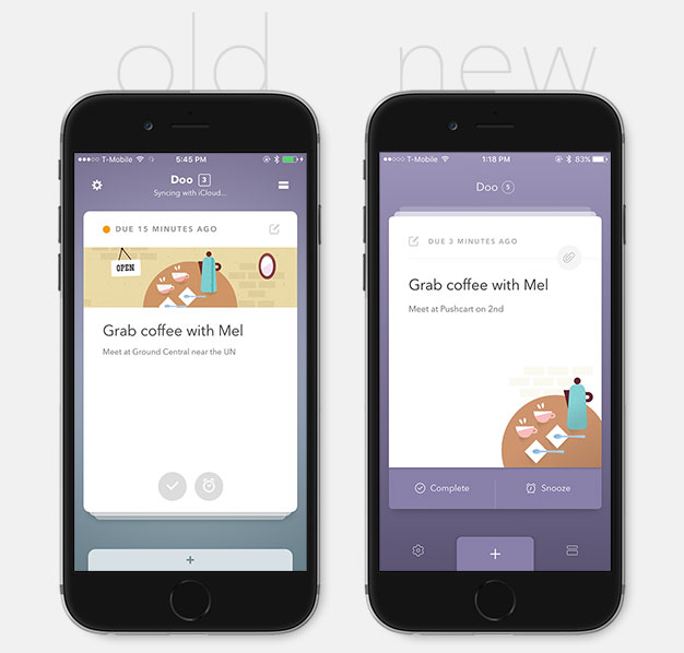
I originally wanted the cards to be typography driven, but they ended up feeling sterile. I added an illustration to give each card warmth. The complete and snooze buttons brought improved discoverability and accessibility. I positioned the buttons inside each card so I could highlight them during gestures and create a direct association with the task.
The challenge with cards was to create a sense of urgency for overdue tasks and to keep things approachable.
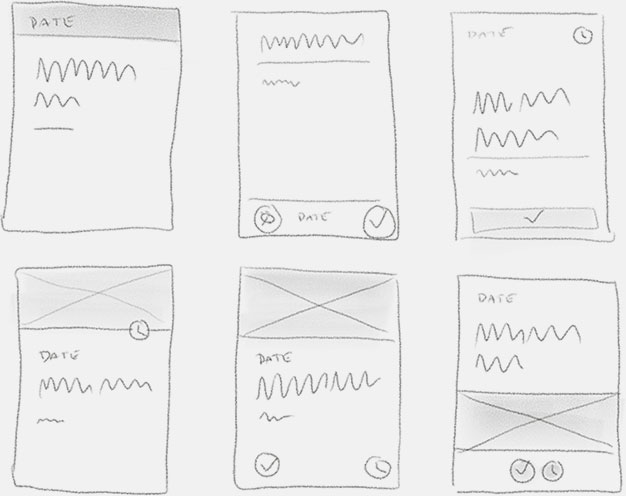
The challenge with cards was to create a sense of urgency for overdue tasks and to keep things approachable. Early explorations also revealed that typography wouldn’t be enough to make the experience feel personal. I would have to add images. Doo launched with the date at the top bounded by the image because it’s the most important piece of information. And the content appears beneath so there’s always a place for the eye to rest.
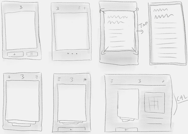
The main card view went through a few iterations. I explored the possibility of allowing cards to expand when tapped. I especially wanted to accommodate long lists. However when I prototyped this experience I realized that it was an anti-pattern. I didn’t want to encourage people to dump a long list of things into the notes section, or to write to-dos that were a paragraph long. Doo had be opinionated for the success of my users.
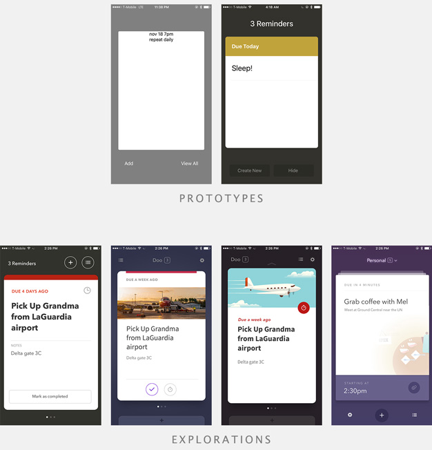
Doo presents each card in a stack, forcing your attention onto one thing at a time. You can’t randomly access your to-dos like you would a scrolling list. This way users have to acknowledge each task and make a deliberate choice whether to act or to snooze.
I launched the first version of Doo with a limited scope so I could iterate with real users. The goal was to launch a product that would work for 90% of people. This meant Doo had to get the basics right: Creating repeating tasks, prioritization, and completion/snooze. Everything else was a distraction.
As you might expect, after launch the feature requests began to pile up. I saw new features as the perfect opportunity for a design realignment that would lay the foundation for future additions like attachments. The update repurposed the illustrations to make more room for the title and notes. It also allowed the buttons to recede, further emphasizing the task. The attachments button fits naturally in the top right corner, out of the way until needed.
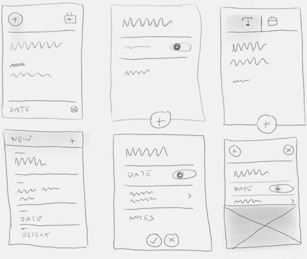
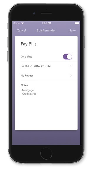
The edit screen was the most difficult view to get right. The goal was to enable users to understand the scope of a reminder without showing everything at once. Early concepts and prototypes were more waterfall in nature and didn’t do enough to provide varying levels of hierarchy. Further iterations moved the save and cancel buttons to the bottom of the card to improve one-handed use and push up the primary inputs. This proved problematic with the keyboard.
I experimented with tabs and other means of creating structure. In one iteration I put date selection behind a calendar icon and a toggle. The calendar icon was too disconnected from the date itself. Disclosure arrows that hinted at navigation competed with clear buttons. Attempts to solve each of these problems simultaneously often resulted in a dead end.
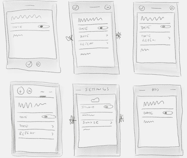
The solution was to step back and evaluate the edit card in the context of a larger navigation pattern.
The solution was to step back and evaluate the edit card in the context of a larger navigation pattern. I wanted each view to be a card that slid up from the bottom instead of the usual full-screen slide from the right.
In order to make this work, each screen gained a consistent title, primary action, and dismiss button. Cards would not be able to hold the actions within the content area. The result is a clear hierarchy that allows the edit screen to read like a sentence. The default state displays only the title and notes to optimize for quick task entry.
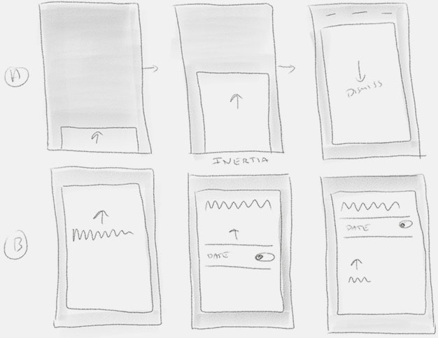
The resulting navigation pattern provided enough flexibility to use across edit, settings, and other views. I could draw each screen as a card that would stack on top of one another. And I accomplished one-handed use by making each card dismissible with a downward swipe. TestFlight results were positive, proving that the gesture-based nature of Doo lent itself well across screens. The text buttons provided the necessary discoverability until users discovered the gesture.
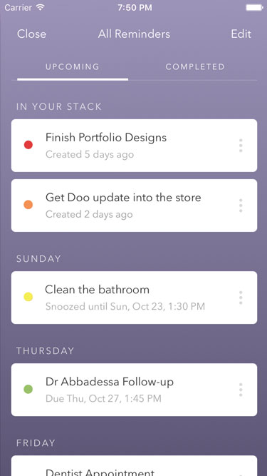
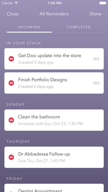
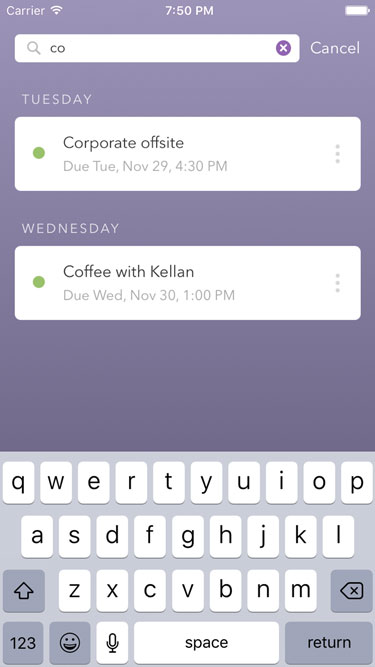
Get a jump on upcoming tasks or search for an existing reminder. Sort reminders in-place to set the day’s priorities.
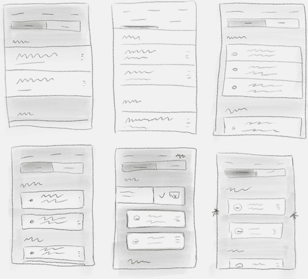
I created a few variations of the list view early on, but quickly zeroed in on a layout. The navigation pattern dictated the background color be visible at all times, so transitions occurred from purple to purple. Going white to purple hurt the card illusion. I also didn’t want to introduce views that felt inconsistent.
I designed each row as a miniature card to create a visual relationship between reminders across screens.
I designed each row as a miniature card to create a visual relationship between reminders across screens. It had the added effect of making how many tasks appeared within the list more glanceable. It also mapped more closely to the sorting experience, which manipulates single rows. Drag and drop allows users to prioritize reminders in relation to one another. Unlike apps that use exclamation points to try and guess relative priority, Doo always knows your intention. New reminders insert themselves respecting sort and date order.
The final edit experience includes the standard iOS delete icon but deviates from the swipe paradigm. Revealing the standard delete disclosure made the interface feel disjointed. I also wanted to reveal up to five different options per row. I opted for a flexible menu button that could toggle a dialog from the bottom of the screen with any number of actions.
Make sure tasks have a single, achievable step.
Select no more than three tasks and snooze the rest.
Complete your stack and see big progress over time.
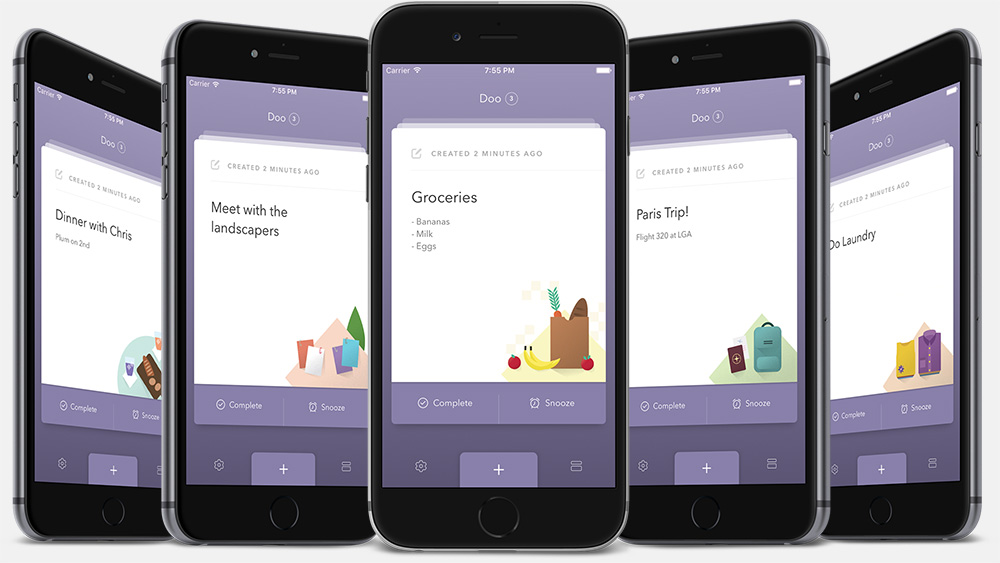
Warm illustrations add personality to your cards. Each image is chosen automatically based on the task title. This small addition makes using Doo a more satisfying experience. Manage your free time, not your to-dos.
I absolutely love this app... *incredibly* satisfying. — Buzzfeed
Doo launched to positive reviews. Apple featured Doo in Best New Apps and the Best of February. It would go on to be selected for Best of App Store 2016. Publications including Wired, Buzzfeed, and The Next Web wrote about the satisfying and unique user experience.
I’m incredibly grateful to my friends and family for all of their support and encouragement. It was one of the most challenging periods of my life. I learned more in six months than I ever had before. I couldn’t be more excited to continue making Doo better and better.



I’m a quality-driven leader who can conceptualize, design, and build digital solutions. My enthusiasm for design comes through in my positive attitude and ambition. Major publications like Wired, Buzzfeed, and Gizmodo have praised my work for its ingenuity. I’m grateful for the fearless collaboration and support of my colleagues. In my spare time I’m an advocate for civil rights, net neutrality, and the environment. Follow me on Twitter for banter on design, politics, and the quirks of city living.